
If you update your website with new forms, schedules and curriculum guides over the summer months – your attention please – now it’s time to do more! To keep this vital resource firing on all (digital) cylinders during the school year and admission season, take a hard look at your website through the eyes of your prospects.
Here are some excellent website tips to keep your prospects moving through and enjoying your website.
How long is your website’s inquiry form?
If you have a long form with too many questions, your prospect may leave midway through. This is not the time to gather lots of details on what sports a prospective student plays or ask for a detailed list of legacies. Just get the facts: name, contact information, name and year of prospective student.
You want a quick form for someone to fill out on the fly and access easily on a mobile device. Avoid losing your prospect’s interest because you’ve asked them to answer to many questions. Send a link to the longer form in your follow-up email.
Take a page from the Finalsite U conference this past summer and create an “ask a question” button for your website homepage. This “call to action” button leads to a very short inquiry form that allows the user to ask a question. Check out Trinity Christian School’s five questions (yes, five). They’ve crafted an easy way to get contact info from prospective students/families.
Why not add the button to the short form on the landing pages where most visitors go, such as the tuition page or admission events page? It’s a great way to keep viewers on your website and influence them to personally engage with you.
Visit Finalsite.com for loads more genius website ideas taken from the 2017 Finalsite U.
How long is your website copy?
Less is definitely more. Any visitor or user, especially your website’s primary audience – prospective parents and students – needs to quickly find what he or she is looking for and have an easy time doing it. That means keeping your copy to a minimum with links to other pages. Say what you need to say and offer “calls to action” that motivate viewers to “READ MORE.”
A good test is checking out your pages on your mobile device. This visual exercise quickly shows where your copy needs chopping. Remember, a viewer’s finger can only scroll through so much copy before it gets tired.
Same goes for navigation. A good rule of thumb is 6 to 8 items on the top-level navigation. Watch out for sub-page creep, too. Take time this summer to houseclean your sub-pages and purge/combine what you can.
Current parents are constant users of your website. Ask your colleagues on the academic and parent relations side what info parents ask for the most. Is it on your website? It should be! Add it to your quick links on the homepage and, if you have a parent landing page, make sure these items are easily found. (You’d be surprised how many parents go on each day during the school year to find the lunch menu. Don’t make them search for it.)
Same goes for your athletics pages. Most current families (and alumni) want to find game schedules, sports scores, away game locations, etc. easily and quickly. Ask your athletic director what info needs to be front and center for your fans.
“Like any good summer trip, your website is both journey and destination.”
Are We There Yet?
It’s what your family says on your summer road trip and what your website visitors say when they can’t access any part of your website quickly. If they can’t easily get to the information they want, they’re likely to leave your site in a flash.
Website visitors should be able to get to any part of your site in less than three clicks. While studies show that viewers will click more than three times, why make them?
A 2015 Canadian study determined that, thanks in large part to technology, humans now have the attention span of a goldfish – eight seconds. That goes for your website visitors, too, so keep their attention, and don’t make them search for these answers. Prospects want stats on academic distinctions and expectations (how many APs? What is the average class size? What sets your school or college apart?). Once they find the info, keep them moving through your site with valuable information that encourages them to “turn the page,” so to speak.
Like any good summer trip, your website is both journey and destination. On the stat about how many faculty you have, why not link a short video Q&A with your faculty on why they love teaching or a news round-up of all the awards your faculty have garnered in the past two years? On the page with all the admission dates and deadlines, is there a user-friendly printable of an admission checklist or news articles on student achievements? Chances are, you have lots of content to repurpose on your website for engaging visitors.
Say it Loud, Say it Proud.
Your homepage is a carefully branded representation of your school. Make sure that branding extends throughout the site. Is your branding and messaging on sub-pages? It should be, especially since prospects may bypass your homepage through organic searches, such as typing in “tuition NAME OF YOUR SCHOOL.” Who you are and what sets you apart needs to be evident on these pages, too. Use Google Analytics to determine your most popular entry pages and make sure that they are not brandless dead ends.
Does Your Website Have “Click Here” Burnout (or Spam)?
You need to keep prospects moving through your site with “calls to action” – buttons to click on to learn more, fill out a form, etc. – but avoid the hackneyed “Click Here” button. It’s obvious and it’s poor SEO. (And it dates your site. In the age of mobile devices, we are tapping our way through sites.)
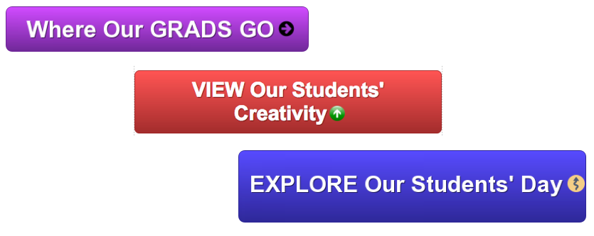
Be creative with your buttons! And be sure to change them up throughout admission season as the admission and academic year cycles change. Here are some ideas:
- Instead of “Click Here for Student Schedule,” link “Explore Our Students’ Day” with an infographic of a typical day.
- Change “Click Here for Photo Gallery” to “View Our Students’ Creativity,” a button that sends viewers to a photo gallery of student artwork.
- Rather then “Click Here for College/Career List,” point “Where our Grads Go” to the college or career list.
By employing your prospect’s eye along with a little time and planning, your website will be school-year worthy in no time.
What sets your school’s website apart from the competition? Share your stories of web success with our community in a comment
Want your website to shine? We can help. Contact us here.
Stay up-to-date on the Kalix Summer Marketing Series.
#1 What is your Word of Mouth Saying about your School?
#2 7 Easy Ways to Take the Blah out of Blogging for Your School
#3 Best Ways to Work with Graphic Designers
#4 How to Execute a Social Media Audit for Your School
#5 What’s Your Position on Brand Positioning?
Jonathan Oleisky is President of Kalix Marketing.